Using the Output Delivery System
Example 23.10 Correlation and Covariance Matrices
(View the complete code for this example.)
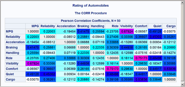
This example demonstrates how you can use ODS to set the background color of individual cells in a table. The color is set to reflect the magnitude of the value in the cell. You can use color to call attention to larger values and to see the pattern in the data in a way that is hard to visualize just by looking at the numbers. This is illustrated with correlation and covariance matrices. The data for this first part of this example are ratings of automobiles. The following statements create the data set:
title 'Rating of Automobiles';

data cars;
   input Origin $ 1-8 Make $ 10-19 Model $ 21-36
         (MPG Reliability Acceleration Braking Handling Ride
          Visibility Comfort Quiet Cargo) (1.);
   datalines;
GMC      Buick      Century         3334444544
GMC      Buick      Electra         2434453555
GMC      Buick      Lesabre         2354353545

   ... more lines ...

GMC      Pontiac    Sunbird         3134533234
;
The following steps edit the template that PROC CORR uses to display the correlation matrix. The CELLSTYLE statement sets the background color to light gray for correlations equal to 1 or –1. Values less than –0.75 or greater than 0.75 are set to red. Values less than –0.50 or greater than 0.50 are set to blue. Values less than –0.25 or greater than 0.25 are set to cyan. Values in the range –0.25 to 0.25 are set to white. PROC CORR is then run using the custom template. Finally, the default template is restored. The following statements produce Figure 14:
proc template;
   edit Base.Corr.StackedMatrix;
      column (RowName RowLabel) (Matrix) * (Matrix2);
      edit matrix;
         cellstyle _val_  = -1.00 as {backgroundcolor=CXEEEEEE},
                   _val_ <= -0.75 as {backgroundcolor=red},
                   _val_ <= -0.50 as {backgroundcolor=blue},
                   _val_ <= -0.25 as {backgroundcolor=cyan},
                   _val_ <=  0.25 as {backgroundcolor=white},
                   _val_ <=  0.50 as {backgroundcolor=cyan},
                   _val_ <=  0.75 as {backgroundcolor=blue},
                   _val_ <   1.00 as {backgroundcolor=red},
                   _val_  =  1.00 as {backgroundcolor=CXEEEEEE};
      end;
   end;
run;

ods _all_ close;
ods html body='corr.html' style=HTMLBlue;

proc corr data=cars noprob;
   ods select PearsonCorr;
run;

ods html close;
ods html;
ods pdf;

proc template;
   delete Base.Corr.StackedMatrix / store=sasuser.templat;
run;
Figure 14: Correlation Matrix from PROC CORR

The preceding statements used a small number of discrete colors to show the range of values. In contrast, the following statements use a color gradient. The SAS autocall macro %Paint is available for generating the CELLSTYLE colors list with a list of interpolated colors. If your site has installed the autocall libraries supplied by the SAS System and uses the standard configuration of software supplied by the SAS System, you need to ensure that the SAS System option MAUTOSOURCE is in effect before you begin using autocall macros. The macros do not have to be included (for example, with a %INCLUDE statement). They can be called directly once they are properly installed. For more information about autocall libraries, see SAS Macro Language: Reference.
Usually, you can use the %Paint macro by specifying a list of values and a list of colors. Here is an example for values that range from 0 to 10:
%paint(values=0 to 10 by 0.5,
       colors=white cyan blue magenta red)

proc print data=colors;
run;
The %Paint macro prints the following information to the SAS log:
   Legend:
          0 = White
        2.5 = Cyan
          5 = Blue
        7.5 = Magenta
         10 = Red
A value of 0 maps to white, a value of 2.5 maps to cyan, values in the range 0 to 2.5 map to colors in the range from white to cyan, and so on. The %Paint macro for this step creates an output data set, Colors, which is shown in Output 23.10.1.
Output 23.10.1: Color Interpolation
| Rating of Automobiles |
| Obs | Start | _RGB_ |
|---|---|---|
| 1 | 0.0 | CXFFFFFF |
| 2 | 0.5 | CXCBFFFF |
| 3 | 1.0 | CX97FFFF |
| 4 | 1.5 | CX63FFFF |
| 5 | 2.0 | CX2FFFFF |
| 6 | 2.5 | CX05FFFF |
| 7 | 3.0 | CX00D1FF |
| 8 | 3.5 | CX009CFF |
| 9 | 4.0 | CX0068FF |
| 10 | 4.5 | CX0034FF |
| 11 | 5.0 | CX0000FF |
| 12 | 5.5 | CX3400FF |
| 13 | 6.0 | CX6800FF |
| 14 | 6.5 | CX9C00FF |
| 15 | 7.0 | CXD100FF |
| 16 | 7.5 | CXFA00FF |
| 17 | 8.0 | CXFF00D1 |
| 18 | 8.5 | CXFF009C |
| 19 | 9.0 | CXFF0068 |
| 20 | 9.5 | CXFF0034 |
| 21 | 10.0 | CXFF0000 |
This shows the color interpolation for a series of points. You could use a smaller BY value in the %Paint macro to get more points along the color gradient. However, a few dozen colors are usually sufficient for most purposes.
The following steps use the %Paint macro to create a color gradient for a correlation matrix, edit the template, display the results, and restore the default template:
%paint(values=-1 to 1 by 0.05, macro=setstyle,
       colors=CXEEEEEE red magenta blue cyan white
              cyan blue magenta red CXEEEEEE
              -1 -0.99 -0.75 -0.5 -0.25 0 0.25 0.5 0.75 0.99 1)

proc template;
   edit Base.Corr.StackedMatrix;
      column (RowName RowLabel) (Matrix) * (Matrix2);
      edit matrix;
         %setstyle(backgroundcolor)
      end;
   end;
run;

ods _all_ close;
ods html body='corr.html' style=HTMLBlue;
proc corr data=cars noprob;
   ods select PearsonCorr;
run;
ods html close;
ods html;
ods pdf;

proc template;
   delete Base.Corr.StackedMatrix / store=sasuser.templat;
run;
The VALUES= option creates a range of values from –1 to 1 with an increment of 0.05. The %Paint macro generates a CELLSTYLE _val_ <= value as {backgroundcolor= color}, line for each value in the list. Specifically, it generates a macro named SETSTYLE (from the MACRO= option) that contains the entire CELLSTYLE statement for use in PROC TEMPLATE. The argument to the macro is the option that you want to set. In this case, it is the background color. You could specify foreground instead to set the color of the numbers themselves. The first part of the generated statement is as follows:
cellstyle _val_<=-1 as {backgroundcolor=CXEFEEEE},
          _val_<=-0.95 as {backgroundcolor=CXFF0020},
          _val_<=-0.9 as {backgroundcolor=CXFF0062},
          _val_<=-0.85 as {backgroundcolor=CXFF008D},
          _val_<=-0.8 as {backgroundcolor=CXFF00CF},
The color mapping for a correlation matrix can be a bit more involved than it is for most tables. This is because you might want the maximum correlations, 1 and –1, to be displayed using colors outside the gradient that is used for other values. Usually, you specify the color list, and the %Paint macro maps the first color to the minimum value, the last color to the maximum value, and colors in between using equal increments and values based on the minimum and maximum. Alternatively, you can provide these values, as shown in this example. The legend, displayed in the SAS log, is as follows for the %Paint macro step:
   Legend:
         -1 = CXEEEEEE
      -0.99 = Red
      -0.75 = Magenta
       -0.5 = Blue
      -0.25 = Cyan
          0 = White
       0.25 = Cyan
        0.5 = Blue
       0.75 = Magenta
       0.99 = Red
          1 = CXEEEEEE
Values in the range –0.99 to 0.99 follow the interpolation red to magenta to blue to cyan to white to cyan to blue to magenta to red. Of course, the actual correlations for these data do not span this entire range, so a pure red background does not appear in the matrix. Correlations of 1 and –1 are displayed as light gray. The resulting correlation matrix is displayed in Figure 15. Notice that there are now a number of shades of colors, particularly shades of blues, not just a few discrete colors. The largest values are displayed in shades of purple and magenta.
Figure 15: Correlation Matrix from PROC CORR with a Color Gradient
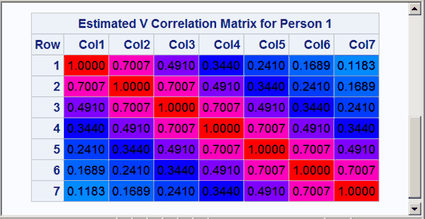
Next, the same technique is used to display the covariance and correlation matrices of a heteroscedastic autoregressive model. The data are based on the famous growth measurement data of Pothoff and Roy (1964), but are modified here to illustrate the technique of painting the entries of a matrix. The data consist of four repeated growth measurements of 11 girls and 16 boys. The measurements from two adjacent children in the original data were combined and rearranged here to emulate a repeated measures sequence with eight observations. The following statements create the data set:
title 'Analysis of Repeated Growth Measures';

data pr;
   input Person Gender $ y1 y2 y3 y4 y5 y6 y7 y8;
   array y{8};
   do time=5,7,8,4,3,2,1;
      Response = y{time};
      Age      = time+7;
      output;
   end;
   datalines;
 1   F   21.0  20.0  21.5  23.0  21.0  21.5  24.0  25.5
 2   F   20.5  24.0  24.5  26.0  23.5  24.5  25.0  26.5
 3   F   21.5  23.0  22.5  23.5  20.0  21.0  21.0  22.5
 4   F   21.5  22.5  23.0  25.0  23.0  23.0  23.5  24.0
 5   F   20.0  21.0  22.0  21.5  16.5  19.0  19.0  19.5
 6   F   24.5  25.0  28.0  28.0  26.0  25.0  29.0  31.0
 7   M   21.5  22.5  23.0  26.5  23.0  22.5  24.0  27.5
 8   M   25.5  27.5  26.5  27.0  20.0  23.5  22.5  26.0
 9   M   24.5  25.5  27.0  28.5  22.0  22.0  24.5  26.5
10   M   24.0  21.5  24.5  25.5  23.0  20.5  31.0  26.0
11   M   27.5  28.0  31.0  31.5  23.0  23.0  23.5  25.0
12   M   21.5  23.5  24.0  28.0  17.0  24.5  26.0  29.5
13   M   22.5  25.5  25.5  26.0  23.0  24.5  26.0  30.0
;
The following statements create a macro that sets colors for the covariance matrix (SETSTYLE1), create a macro that sets colors for the correlation matrix (SETSTYLE2), edit the templates, run the analysis with PROC GLIMMIX, and restore the default templates:
* You need to run the analysis once to know that 20 is a good maximum;
%paint(values=0 to 20 by 0.25,
       colors=cyan blue magenta red, macro=setstyle1)

%paint(values=0 to 1 by 0.05,
       colors=cyan blue magenta red, macro=setstyle2)

proc template;
   edit Stat.Glimmix.V;
      column Subject Index Row Col;
      edit Col;
         %setstyle1(backgroundcolor)
      end;
   end;
   edit Stat.Glimmix.VCorr;
      column Subject Index Row Col;
      edit Col;
         %setstyle2(backgroundcolor)
      end;
   end;
run;

ods _all_ close;
ods html body='ar1.html' style=HTMLBlue;
proc glimmix data=pr;
   class person gender time;
   model response = gender age gender*age;
   random _residual_ / sub=person type=arh(1) v residual vcorr;
   ods select v vcorr;
run;
ods html close;
ods html;
ods pdf;

proc template;
   delete Stat.Glimmix.V / store=sasuser.templat;
   delete Stat.Glimmix.VCorr / store=sasuser.templat;
run;
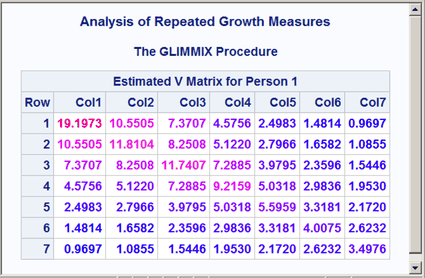
The results are displayed in Figure 16 and Figure 17. Both the covariance and correlation matrices have a structure that is more obvious when colors are added to the display. In particular, the colors clearly show the banded structure of the correlation matrix.
Figure 16: Heteroscedastic AR(1) Covariance Matrix
Figure 17: Heteroscedastic AR(1) Correlation Matrix
Alternatively, you could just use the %Paint macro to do the color interpolation and use its output data set to create other types of style effects. The following statements show one way to set the font to bold and set the foreground color based on the values of the covariances:
%let inc = 0.25;

%paint(values=0 to 20 by &inc, colors=blue magenta red)

data cntlin;
   set colors;
   fmtname = 'paintfmt';
   label = _rgb_;
   end = start + &inc;
   keep start end label fmtname;
run;

proc format cntlin=cntlin;
run;

proc template;
   edit Stat.Glimmix.V;
      column Subject Index Row Col;
      edit Col;
         style = {foreground=paintfmt8. font_weight=bold};
      end;
   end;
run;

ods _all_ close;
ods html body='ar1.html' style=HTMLBlue;
proc glimmix data=pr;
   class person gender time;
   model response = gender age gender*age;
   random _residual_ / sub=person type=arh(1) v residual;
   ods select v;
run;
ods html close;
ods html;
ods pdf;

proc template;
   delete Stat.Glimmix.V / store=sasuser.templat;
run;
title;
The %Paint macro creates the SAS data set Colors with the result of the interpolation. This data set can be processed to create a format. The DATA step creates a range of values from Start to End and assigns a color to Label based on the color computed by the %Paint macro. This data set is input to PROC FORMAT to create the format PAINTFMT. PROC TEMPLATE uses this format to set the color of the values in the table. The cell value is evaluated using the specified FOREGROUND= format for every cell in the table, and the appropriate color is assigned. PROC GLIMMIX does the analysis, and the results are displayed in Figure 18.
Figure 18: Heteroscedastic AR(1) Covariance Matrix
Many other effects could be achieved by using this approach and different options in the STYLE= specification.
The following steps print the lower triangle of a correlation matrix:
ods select none;
proc corr data=sashelp.cars noprob;
   ods output PearsonCorr=p;
run;
ods select all;

data p2;
   set p end=eof;
   array __n[*] _numeric_;
   do __i = _n_ to dim(__n); __n[__i] = ._; end;
   if _n_ = 1 then do;
      call execute('data _null_; set p2;');
      call execute('file print ods=(template="Base.Corr.StackedMatrix"');
      call execute('columns=(rowname=variable');
   end;
   call execute(cats('matrix=',vname(__n[_n_]),'(generic)'));
   if eof then call execute(')); put _ods_; run;');
run;
The PROC CORR step suppresses all displayed output and creates an ODS output data set that contains the correlation matrix. The DATA step does two things: it modifies the correlation matrix so that all values on or above the diagonal are set to an underscore missing value, and it generates a second DATA step that contains ad hoc rendering code that displays the modified matrix. The template has a statement that translates the underscore missing values into blanks. The rendering code specifies the mapping between the template column name Rowname and the data set variable called Variable. This variable provides the row labels. Because the columns of a correlation matrix cannot be known until the procedure runs, the columns are designated as GENERIC in the template column definition. The ODS template has a single placeholder column named Matrix for each correlation matrix column. The rendering code declares the mappings between the template generic column and the variables in the data set. In this example, the DATA P2 step uses CALL EXECUTE statements to generate the following DATA _NULL_ step (reformatted slightly from its original form):
data _null_;
   set p2;
   file print ods=(template="Base.Corr.StackedMatrix"
                   columns=(rowname=variable
                            matrix=MSRP(generic)
                            matrix=Invoice(generic)
                            matrix=EngineSize(generic)
                            matrix=Cylinders(generic)
                            matrix=Horsepower(generic)
                            matrix=MPG_City(generic)
                            matrix=MPG_Highway(generic)
                            matrix=Weight(generic)
                            matrix=Wheelbase(generic)
                            matrix=Length(generic)));
   put _ods_;
run;
CALL EXECUTE statements write the generated code to a buffer. The resulting DATA _NULL_ step executes after the DATA P2 step finishes.
The lower triangle is displayed in Output 23.10.2.
Output 23.10.2: Lower Triangle
| Variable | MSRP | Invoice | EngineSize | Cylinders | Horsepower | MPG_City | MPG_Highway | Weight | Wheelbase | Length |
|---|---|---|---|---|---|---|---|---|---|---|
| MSRP | ||||||||||
| Invoice | 0.99913 | |||||||||
| EngineSize | 0.57175 | 0.56450 | ||||||||
| Cylinders | 0.64974 | 0.64523 | 0.90800 | |||||||
| Horsepower | 0.82695 | 0.82375 | 0.78743 | 0.81034 | ||||||
| MPG_City | -0.47502 | -0.47044 | -0.70947 | -0.68440 | -0.67670 | |||||
| MPG_Highway | -0.43962 | -0.43459 | -0.71730 | -0.67610 | -0.64720 | 0.94102 | ||||
| Weight | 0.44843 | 0.44233 | 0.80787 | 0.74221 | 0.63080 | -0.73797 | -0.79099 | |||
| Wheelbase | 0.15200 | 0.14833 | 0.63652 | 0.54673 | 0.38740 | -0.50728 | -0.52466 | 0.76070 | ||
| Length | 0.17204 | 0.16659 | 0.63745 | 0.54778 | 0.38155 | -0.50153 | -0.46609 | 0.69002 | 0.88919 |
The following DATA step uses the same ODS OUTPUT data set from PROC CORR, p, and displays the lower triangle, omitting the first row and last column, which are blank:
data p2;
   set p end=eof;
   array __n[*] _numeric_;
   do __i = _n_ to dim(__n); __n[__i] = ._; end;
   if _n_ = 1 then do;
      call execute('data _null_; set p2;');
      call execute('file print ods=(template="Base.Corr.StackedMatrix"');
      call execute('columns=(rowname=variable');
   end;
   if not eof then call execute(cats('matrix=',vname(__n[_n_]),'(generic)'));
   if eof then call execute(')); if _n_ ne 1 then put _ods_; run;');
run;
This DATA step contains two IF conditions, if not eof then and if _n_ ne 1 then, that omit the last column and first row, respectively. The lower triangle, without the first row and last column, is displayed in Output 23.10.3.
Output 23.10.3: Lower Triangle Omitting Blank Row and Column
| Variable | MSRP | Invoice | EngineSize | Cylinders | Horsepower | MPG_City | MPG_Highway | Weight | Wheelbase |
|---|---|---|---|---|---|---|---|---|---|
| Invoice | 0.99913 | ||||||||
| EngineSize | 0.57175 | 0.56450 | |||||||
| Cylinders | 0.64974 | 0.64523 | 0.90800 | ||||||
| Horsepower | 0.82695 | 0.82375 | 0.78743 | 0.81034 | |||||
| MPG_City | -0.47502 | -0.47044 | -0.70947 | -0.68440 | -0.67670 | ||||
| MPG_Highway | -0.43962 | -0.43459 | -0.71730 | -0.67610 | -0.64720 | 0.94102 | |||
| Weight | 0.44843 | 0.44233 | 0.80787 | 0.74221 | 0.63080 | -0.73797 | -0.79099 | ||
| Wheelbase | 0.15200 | 0.14833 | 0.63652 | 0.54673 | 0.38740 | -0.50728 | -0.52466 | 0.76070 | |
| Length | 0.17204 | 0.16659 | 0.63745 | 0.54778 | 0.38155 | -0.50153 | -0.46609 | 0.69002 | 0.88919 |
You can display the upper triangle instead of the lower triangle by replacing the first DO loop with the second:
* Display lower. Blank out the upper.;
do __i = _n_ to dim(__n); __n[__i] = ._; end;

* Display upper. Blank out the lower.;
do __i = 1 to _n_; __n[__i] = ._; end;
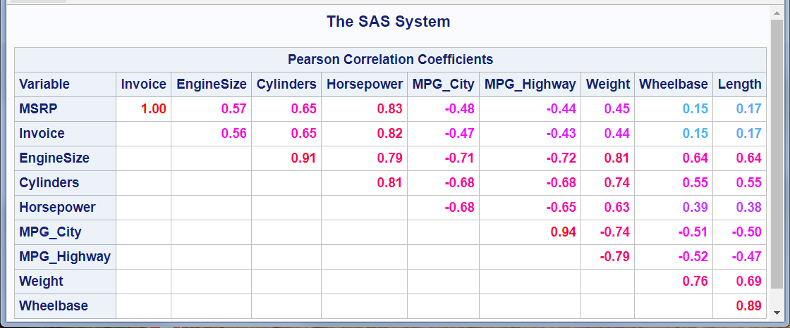
You also need to omit the last row and the first column (instead of the first row and the last column). The following steps change the format, display the upper triangle, and use the %Paint macro to display larger absolute values in red and values near zero in cyan:
%let inc = 0.01;
%paint(values=-1 to 1 by &inc, colors=red magenta cyan magenta red)

data cntlin;
   set colors;
   FmtName = 'paintfmt';
   Label = _rgb_;
   End = round(start + &inc, &inc);
   keep start end label fmtname;
run;

proc format cntlin=cntlin; run;

proc template;
   edit Base.Corr.StackedMatrix;
      column (RowName RowLabel) (Matrix);
      header 'Pearson Correlation Coefficients';
      edit matrix;format=5.2 style={foreground=paintfmt8. font_weight=bold};end;
   end;
quit;

ods select none;
proc corr data=sashelp.cars noprob;
   ods output PearsonCorr=p;
run;
ods select all;

ods _all_ close;
ods html body='upper.html' style=HTMLBlue;

data p2;
   set p end=eof;
   array __n[*] _numeric_;
   do __i = 1 to _n_; __n[__i] = ._; end;
   if _n_ = 1 then do;
      call execute('data _null_; set p2 end=eof;');
      call execute('file print ods=(template="Base.Corr.StackedMatrix"');
      call execute('columns=(rowname=variable');
   end;
   if _n_ ne 1 then call execute(cats('matrix=',vname(__n[_n_]),'(generic)'));
   if eof then call execute(')); if not eof then put _ods_; run;');
run;

ods html close;
ods html;
ods pdf;

proc template;
   delete Base.Corr.StackedMatrix / store=sasuser.templat;
quit;
The upper triangle of the correlation matrix is displayed in Figure 19.
Figure 19: Upper Triangle with Format Change and Color Changes