The QUANTREG Procedure
ODS Graphics
Statistical procedures use ODS Graphics to create graphs as part of their output. ODS Graphics is described in detail in Chapter 24, Statistical Graphics Using ODS.
Before you create graphs, ODS Graphics must be enabled (for example, by specifying the ODS GRAPHICS ON statement). For more information about enabling and disabling ODS Graphics, see the section Enabling and Disabling ODS Graphics in Chapter 24, Statistical Graphics Using ODS.
The overall appearance of graphs is controlled by ODS styles. Styles and other aspects of using ODS Graphics are discussed in the section A Primer on ODS Statistical Graphics in Chapter 24, Statistical Graphics Using ODS.
For a single quantile, two plots are particularly useful in revealing outliers and leverage points: a scatter plot of the standardized residuals for the specified quantile against the robust distances and a scatter plot of the robust distances against the classical Mahalanobis distances. You can request these two plots by using the PLOT=RDPLOT and PLOT=DDPLOT options, respectively.
You can also request a normal quantile-quantile plot and a histogram of the standardized residuals for the specified quantile by using the PLOT=QQPLOT and PLOT=HISTOGRAM options, respectively.
You can request a plot of fitted conditional quantiles by the single continuous variable that is specified in the model by using the PLOT=FITPLOT option.
All these plots can be requested by specifying corresponding plot options in either the PROC QUANTREG statement or the MODEL statement. If you specify same plot options in both statements, options in the PROC QUANTREG statement override options in the MODEL statement.
In addition, you can specify the PLOT=QUANTPLOT option in the MODEL statement to request a quantile process plot with confidence bands.
For more information about these plots, see the PLOT= option in the PROC QUANTREG statement and the PLOT= option in the MODEL statement.
Besides the PROC QUANTREG and the MODEL statements, the CONDDIST statement can also output plots for conditional distribution analysis.
You can request the probability-probability plot by using the PLOT=PPPLOT option in the CONDDIST statement. This plot illustrates the power of the estimated conditional distributions on the response values by plotting the points for the regression quantile levels versus the sample quantile levels.
You can request the CDF plot by using the PLOT=CDFPLOT option in the CONDDIST statement. This plot illustrates the CDF estimates for the specified observations.
You can request the marginal CDF plot by using the PLOT=MCDFPLOT option in the CONDDIST statement. This plot illustrates the marginal CDF estimates and their confidence limit bands for the TrainObs, TestObs, and TestFit marginal CDFs.
You can request the PDF plot by using the PLOT=PDFPLOT option in the CONDDIST statement. This plot illustrates the PDF estimates for the specified observations.
For more information about the plots for the CONDDIST statement, see the PLOT= option in the CONDDIST statement.
All the plot options are summarized in Table 9.
Table 9: Options for Plots
| Keyword | Plot | |
|---|---|---|
| ALL | All appropriate plots | |
| CDFPLOT | Series plot for CDF samples | |
| DDPLOT | Robust distance versus Mahalanobis distance | |
| FITPLOT | Conditional quantile fit versus independent variable | |
| HISTOGRAM | Histogram of standardized robust residuals | |
| MCDFPLOT | Series and CI bands plot for the bootstrap marginal CDFs | |
| NONE | No plot | |
| PDFPLOT | Series plot for PDF estimates | |
| PPPLOT | Regression quantile level versus sample quantile level | |
| QUANTPLOT | Scatter plot of regression quantile | |
| QQPLOT | Q-Q plot of standardized robust residuals | |
| RDPLOT | Standardized robust residual versus robust distance |
The following subsections provide information about these graphs.
ODS Graph Names
The QUANTREG procedure assigns a name to each graph that it creates. You can use these names to refer to the graphs when you use ODS. The names along with the required statements and options are listed in Table 10.
Table 10: Graphs Produced by PROC QUANTREG
| ODS Graph Name | Plot Description | Statements | Option |
|---|---|---|---|
| CDFPlot | Cumulative distribution functions | CONDDIST | CDFPLOT |
| DDPlot | Robust distance versus Mahalanobis distance | PROC QUANTREG, MODEL | DDPLOT |
| FitPlot | Quantile fit versus independent variable | PROC QUANTREG, MODEL | FITPLOT |
| Histogram | Histogram of standardized robust residuals | PROC QUANTREG, MODEL | HISTOGRAM |
| MCDFPlot | Marginal Cumulative distributions functions | CONDDIST | MCDFPLOT |
| PDFPlot | Probability density functions | CONDDIST | PDFPLOT |
| PPPlot | Regression quantile level versus sample quantile level | CONDDIST | PPPLOT |
| QQPlot | Q-Q plot of standardized robust residuals | PROC QUANTREG, MODEL | QQPLOT |
| QuantPanel | Panel of quantile plots with confidence limits | MODEL | QUANTPLOT |
| QuantPlot | Scatter plot for regression quantiles with confidence limits | MODEL | QUANTPLOT UNPACK |
| RDPlot | Standardized robust residual versus robust distance | PROC QUANTREG, MODEL | RDPLOT |
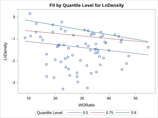
Fit Plot
When the model has a single independent continuous variable (with or without the intercept), the QUANTREG procedure automatically creates a plot of fitted conditional quantiles against this independent variable for one or more quantiles that are specified in the MODEL statement.
The following example reuses the trout data set in the section Analysis of Fish-Habitat Relationships to show the fit plot for one or several quantiles:
ods graphics on;

proc quantreg data=trout ci=resampling;
   model LnDensity = WDRatio / quantile=0.9 seed=1268;
run;
proc quantreg data=trout ci=resampling;
   model LnDensity = WDRatio / quantile=0.5 0.75 0.9 seed=1268;
run;
For a single quantile, the confidence limits for the fitted conditional quantiles are also plotted if you specify the CI=RESAMPLING or CI=SPARSITY option. (See Figure 21.) For multiple quantiles, confidence limits are not plotted by default. (See Figure 22.) You can add the confidence limits on the plot by specifying the option PLOT=FITPLOT(SHOWLIMITS).
The QUANTREG procedure also provides fit plots for quantile regression splines and polynomials if they are based on a single continuous variable. (See Example 103.4 and Example 103.5 for some examples.)
Figure 21: Fit Plot with Confidence Limits
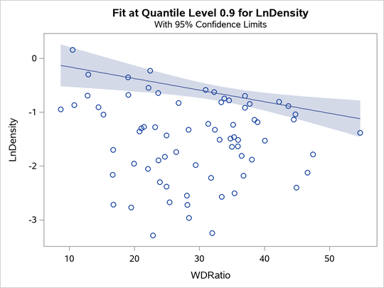
Figure 22: Fit Plot for Multiple Quantiles
Quantile Process Plot
A quantile process plot is a scatter plot of an estimated regression parameter against a quantile. You can request this plot by specifying the PLOT=QUANTPLOT option in the MODEL statement when multiple regression quantiles are computed or when the entire quantile process is computed. Quantile process plots are often used to check model variations at different quantiles, which is usually called model heterogeneity.
By default, panels are used to hold multiple process plots (up to four in each panel). You can use the UNPACK option to request individual process plots. Figure 10 in the section Analysis of Fish-Habitat Relationships shows a panel that includes two quantile process plots. Output 103.2.9 in Example 103.2 shows a single quantile process plot. Example 103.3 demonstrates more quantile process plots and their usage.
Distance-Distance Plot
The distance-distance plot (DDPLOT) is mainly used for leverage-point diagnostics. It is a scatter plot of the robust distances against the classical Mahalanobis distances for the continuous independent variables. For more information about the robust distance, see the section Leverage Point and Outlier Detection. If is a classification variable is specified in the model, this plot is not created.
You can use the PLOT=DDPLOT option to request this plot. The following statements use the growth data set in Example 103.2 to create a single plot, which is shown in Output 103.2.4 in Example 103.2:
proc quantreg data=growth ci=resampling plot=ddplot;
   model GDP = lgdp2 mse2 fse2 fhe2 mhe2 lexp2
               lintr2 gedy2 Iy2 gcony2 lblakp2 pol2 ttrad2
               / quantile=.5 diagnostics leverage(cutoff=8) seed=1268;
   id Country;
run;
The reference lines represent the cutoff values. The diagonal line is also drawn to show the distribution of the distances. By default, all outliers and leverage points are labeled with observation numbers. To change the default, you can use the LABEL= option as described in Table 4.
Residual-Distance Plot
The residual-distance plot (RDPLOT) is used for both outlier and leverage-point diagnostics. It is a scatter plot of the standardized residuals against the robust distances. For more information about the robust distance, see the section Leverage Point and Outlier Detection. If a classification variable is specified in the model, this plot is not created.
You can use the PLOT=RDPLOT option to request this plot. The following statements use the growth data set in Example 103.2 to create a single plot, which is shown in Output 103.2.3 in Example 103.2:
proc quantreg data=growth ci=resampling plot=rdplot;
   model GDP = lgdp2 mse2 fse2 fhe2 mhe2 lexp2
               lintr2 gedy2 Iy2 gcony2 lblakp2 pol2 ttrad2
               / quantile=.5 diagnostics leverage(cutoff=8) seed=1268;
   id Country;
run;
The reference lines represent the cutoff values. By default, all outliers and leverage points are labeled with observation numbers. To change the default, you can use the LABEL= option as described in Table 4.
If you specify ID variables instead of observation numbers in the ID statement, the values of the first ID variable are used as labels.
Histogram and Q-Q Plot
PROC QUANTREG produces a histogram and a Q-Q plot for the standardized residuals. The histogram is superimposed with a normal density curve and a kernel density curve. Using the growth data set in Example 103.2, the following statements create the plot that is shown in Output 103.2.5 in Example 103.2:
proc quantreg data=growth ci=resampling plot=histogram;
   model GDP = lgdp2 mse2 fse2 fhe2 mhe2 lexp2
               lintr2 gedy2 Iy2 gcony2 lblakp2 pol2 ttrad2
               / quantile=.5 diagnostics leverage(cutoff=8) seed=1268;
   id Country;
run;